An Analysis of Gilmore Girls Rankings
With the premier of the older and wiser Gilmore Girls just days away, I thought it would be fun to take a look at the original 153 episodes of the show. I am by no means an expert on the series, or even a huge fan, but I did watch it semi-regularly when it originally aired and re-watched most of the the series earlier this year. I was inspired to do this analysis after coming across some rankings for every single episode. So grab the poptarts and coffee and we can get started!
The Rankings
The rankings come from a couple of different sources. Two were complied by writers for their websites, Vox and Paste Magazine. One is from a Buzz Feed community member and one is from a blogger at The Haunted Coconut. So there is a range of sources, from paid writers to individuals who are really interested in, and presumably somewhat knowledgeable about, the show.
First, we need the data. Wikipedia has a lot of information, including episode titles, writers, directors, air dates, and viewing numbers. For this initial look at the rankings, I didn’t really need the other data but it is available here if you want to download and play around with the numbers.
from __future__ import division

# Import pandas and load the data as a data frame.
import pandas as pd
import numpy as np

df = pd.read_csv('/ipynb/gilmore/gilmore_girls.csv', header=0)

# Import matplotlib
import matplotlib.pyplot as plt
from pylab import rcParams%matplotlib inline
# Use the matplotlib style sheets
plt.style.use('fivethirtyeight')
# Lists to set season positions, rank titles, colors, etc.
sea_num = [0, 22, 44, 66, 88, 110, 132, 153, 153]
transp = np.arange(0.05,0.40,0.05)
mycolor = ['b', 'g', 'm', 'c']
rank_name = ['Vox', 'Paste', 'Buzz', 'Coconut']
fig, ax = plt.subplots(nrows=2, ncols=2, figsize=(12, 8))
plt.subplots_adjust(wspace=0.27, hspace=0.38);
for i in range(4):
temp=221+i #temporary variable for the subplot position
plt.subplot(temp)
plt.plot(df['No. in series'], df[rank_name[i]], linestyle='None', marker='o',
color=mycolor[i], markersize=10, alpha=0.5)
plt.axis((-5,160,160,-5)), plt.grid(axis='x', )
plt.xlabel('Episode Number (series)'), plt.ylabel('Rank')
plt.title(rank_name[i])
for j in range(0,7):
plt.axvspan(sea_num[j], sea_num[j+1], alpha=transp[j], color='purple')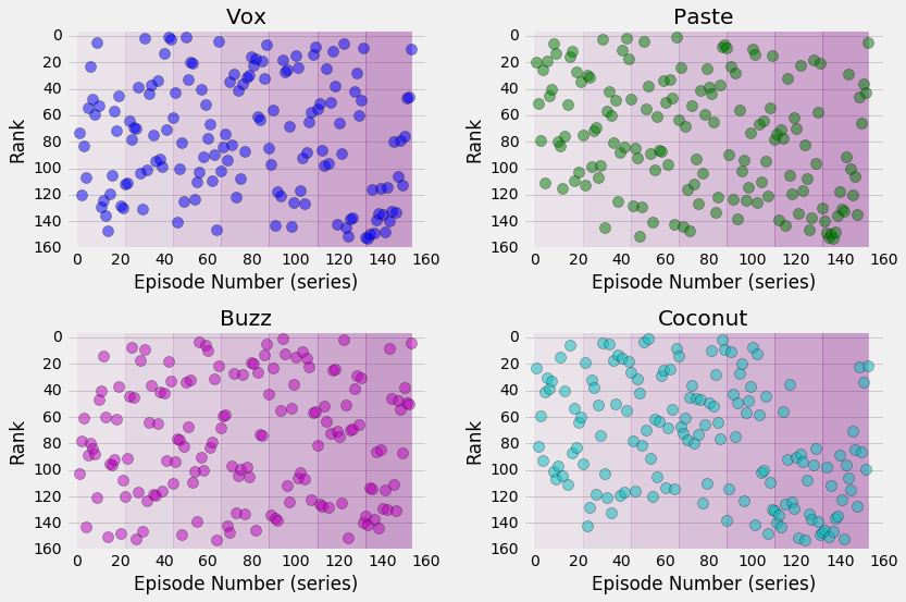
The four different rankings are plotted as a function of the episode number (from 1 to 153). The lower the rank, the better the episode. The seasons are represented by the purple shading, going from light purple for Season 1 to darker for Season 7. This was not intended to represent the overall tone of the seasons, but Season 7 certainly has a greater number of lower rankings so it seems fitting.
What can we see in these rankings? The authors definitely agree that Season 7 wasn’t as good as the other seasons; those early episodes started off pretty bad but did improve near the very end of the series. Season 4 also didn’t have a lot of top ranked episodes, with very few making it into the top 20. But there is a lot of variation for most of the episode rankings, which is good.
So how do these different rankings compare to each other? Let’s average them together, find the standard deviation, and make another plot. I think Rory would like all these plots, right?
# Average over the rankings and add new columns to the dataframe
df['avg'] = df[['Vox', 'Paste', 'Buzz', 'Coconut']].mean(axis=1)
df['std'] = df[['Vox', 'Paste', 'Buzz', 'Coconut']].std(axis=1)rcParams['figure.figsize'] = 12, 6
plt.plot(df['No. in series'], df['Vox'],'b.')
plt.plot(df['No. in series'], df['Paste'],'g.')
plt.plot(df['No. in series'], df['Buzz'],'m.')
plt.plot(df['No. in series'], df['Coconut'],'c.')
plt.errorbar(df['No. in series'], df['avg'], df['std']/2.,
linestyle='None', marker='o', alpha=0.5, color='purple', label='average with std/2')
for i in range(0,7):
plt.axvspan(sea_num[i], sea_num[i+1], alpha=transp[i], color='purple')
plt.axis((1,155,160,1))
plt.grid(axis='x')
plt.xlabel('Episode Number (series)'), plt.ylabel('Rank')
plt.legend(loc=9, bbox_to_anchor=(0.5, -0.15), ncol=6, numpoints=1)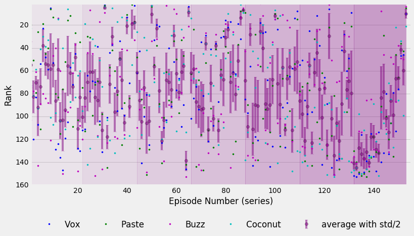
All of the rankings along with their average standard deviation are plotted here. I divided the standard deviation by two since it was kind of large and would have overwhelmed the plot, but you can still get an idea of how much relative variation there is.
There are some interesting features that can be pointed out. A few episodes stand out as great for all four sets of rankings: The Bracebridge Dinner (season 2, episode 10), Raincoats and Recipes (season 4, episode 22), and Wedding Bell Blues (season 5, episode 13).
On the lower ranked side of things, Here Comes the Son (season 3, episode 21) is disliked by all four of the ranking authors and really stands out as the worst episode in Season 3. I wouldn’t be surprised to find that episode on the bottom of most people’s lists; it was intended as the pilot for a spin-off series about Jess. Guess that didn’t work out too well.
Season 7: Well, at least it got better.
And now we come to Season 7. There is an obvious cluster of low ranked episodes with small deviations. It’s no surprise to fans of the show that season 7 didn’t get off to a great start. The main writers left and the show struggled to find a, well, plot. The first two episodes, The Long Morrow and That’s What You Get, Folks, for Makin’ Whoopee, have the two lowest average rankings. The less said about these episodes, the better. There are lots of reviews on the interwebs, so I won’t link any specific ones here. At least things begin to look up towards the end of the series, with a nice steady climb to a decently ranked series finale.
Best and Worst Episodes
Let’s take a quick look at how the standard deviation depends on the average rank. This can help us to see if there is actually any agreement on the best and worst episode rankings.
# Standard deviation as a function of rank
plt.style.use('fivethirtyeight')
rcParams['figure.figsize'] = 10, 6

columns = ['Season 1', 'Season 2', 'Season 3', 'Season 4', 'Season 5', 'Season 6', 'Season 7']
ggcolor = ['r', 'orange', 'y', 'g', 'c', 'b', 'purple']

for i in range(1,8):
    plt.plot(df[df['Season'] == i]['avg'], df[df['Season'] == i]['std'], linestyle='None', marker='o',
             color=ggcolor[i-1], label=columns[i-1])

plt.xlabel('Average Episode Rank'), plt.ylabel('Standard Deviation')
plt.legend(loc=9, bbox_to_anchor=(0.5, -0.15), ncol=4, numpoints=1, fontsize=16)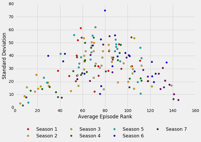
We can see that the standard deviation is relatively low for the higest ranked episodes, especially those in the top 40. The authors of the ranking lists appear to agree on what the best episodes are. This makes sense; most people would probably have an easier time identifying the best shows in a series since what makes an episode “good” might be more agreed upon. There are also relatively smaller standard deviations for the lower ranked episodes but the trend is not as clear here. I think it would be more difficult to pinpoint what makes an episode “bad” since there is likely more variation in what is disliked about a show.
Just a quick note: what is going on with episode 79? The Incredible Sinking Lorelais (season 4, episode 14) got two pretty good rankings (25, 30) and then two poor rankings (105, 120). I guess that was a polarizing episode for this particular set of reviewers!
It might be a good idea to see how the episode rankings change during each individual season. Let’s get the data ready to make yet another plot, this time comparing seasons directly.
# Calculate the average (e.g. average rank of episode 13)
avg_ep = [df[df['No. in season'] == episode]['avg'].mean() for episode in range(1,23)]
#std_ep = [df[df['No. in season'] == episode]['std'].mean() for episode in range(1,23)]

# Calculate the standard deviations for each average eipsode rank (with error propagation)
# Square each element in the column and put the values in a new column
df['std_sq'] = df['std']**2
# Sum the squares for each episode number (e.g. the sum of squares for all 7 episode 13's)
std_prop = [df[df['No. in season'] == episode]['std_sq'].sum() for episode in range(1,23)]
# Take the square root for each sum of squares
std_prop = np.sqrt(std_prop)

# Make separate lists for the error in ranking (makes plotting call less messy)
yerr_m = [x1 - x2 for (x1, x2) in zip(avg_ep, std_prop)]
yerr_p = [x1 + x2 for (x1, x2) in zip(avg_ep, std_prop)]plt.style.use('fivethirtyeight')
rcParams['figure.figsize'] = 12, 6
ggcolor = ['r', 'orange', 'y', 'g', 'c', 'b', 'purple']
columns = ['Season 1','Season 2','Season 3','Season 4','Season 5','Season 6','Season 7']
for i in range(1,8):
plt.plot(df[df['Season'] == i]['No. in season'], df[df['Season'] == i]['avg'], linewidth=1, marker='.',
label=columns[i-1], color=ggcolor[i-1])
plt.plot(df[df['Season'] == i]['No. in season'], yerr_m,
linestyle='--' , linewidth=0.75, color='k', label='Uncertainity')
plt.plot(df[df['Season'] == i]['No. in season'], yerr_p,
linestyle='--' , linewidth=0.75, color='k')
plt.axis((0.5,23,200,-45)), plt.grid(which='minor')
plt.title('Gilmore Girls Episode Rankings')
plt.xlabel('Episode Number'), plt.ylabel('Average Rank')
plt.axvspan(12, 14, alpha=0.1, color='cyan', label='Jan-Feb Sweeps')
plt.axvspan(19, 21, alpha=0.2, color='yellow', label='Apr-May Sweeps')
plt.legend(loc=9, bbox_to_anchor=(0.5, -0.15), ncol=5, numpoints=1, fontsize=16)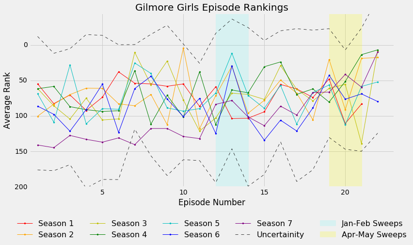
The Lorelai Sweeps?
This is a fun plot! It’s a little bit busy, but we still see some general trends in how the episode rankings change over a season. Except for Season 7 (poor Season 7), the season openers begin with moderately decent rankings. The rankings bounce around a bit until the January-February and April-May sweeps, where there is a definite increase in the average rankings for most of the seasons. Finishing up with each season, we continue with a few more ups and downs before ending with a high-ranked finale, except for Season 1 which had a lower ranking finale compare to the season opener.
The uncertainity in the standard deviation is pretty big, though. With only four sets of rankings, if any one of the rankings is a bit higher or lower than the others, the uncertainity will be large and propagate through. I debated even plotting the uncertainity here but I thought it was important to keep in mind when looking at the overall season rankings. So, using the rankings, which season was the best overall?
# Calculate the average and uncertainity of the rankings for each season
# Create a dataframe to summarize the results (because it prints a pretty table)
df2 = pd.DataFrame(columns=['Season', 'Season average', 'Season std'])
df2['Season'] = np.arange(1,8)
df2['Season average'] = [df[df['Season'] == season]['avg'].mean() for season in range(1,8)]
# Calculate the propagated uncertainity (sum the squares, take the square root)
df2['Season std'] = [df[df['Season'] == season]['std_sq'].sum() for season in range(1,8)]
df2['Season std'] = df2['Season std'].apply(np.sqrt)

df2 = df2.sort_values(by=['Season average'], ascending=True)
Season 4 – 65 (+/- 149)
Season 2 – 68 (+/- 157)
Season 3 – 72 (+/- 143)
Season 1 – 72 (+/- 175)
Season 5 – 72 (+/- 190)
Season 6 – 87 (+/- 180)
Season 7 – 103 (+/- 125)
It looks like season 4 is the winner! But not significantly. The uncertainity is really big, so all the seasons are essentially ranked about the same. Season 7 does stand out (a little) with a lower rank and smaller uncertainity, but even that is not actually significant. All the seasons can be first! With lots many more sets of rankings, that uncertainity would go way down. So, if you really want to know the best season, then time to get reviewing. We’ll need a lot more coffee.
The End
So we have come to the end of this analysis of the Gilmore Girls episode rankings. I hope that this has been as interesting for you as it was for me. There is definitely more to the rankings than I initially thought, and so I really enjoyed putting together this analysis. A big thanks to the writers who carefully watched every single episode and thoughtfully ranked them. And a special thanks to my daughter, who patiently read out list after list for me to enter in my spreadsheet. She has been motivated to begin learning some Python (and to watch the new episodes, of course).